THE APPROACH:
Our CRO approach to this challenge started, as most do, with research. We dug into their Analytics, looking for visitor behavior that might indicate areas to improve. This resulted in us identifying a higher abandonment rate on their product detail pages, – this was especially prevalent on their mobile visits. We performed in-depth website audits for their home page, product detail page (PDP), product category page (PCP), as well as competitive cart user-flow analysis.
The audits revealed multiple ways that their user experience was not meeting best practice for ecommerce User Interface design (UI/UX). We were able to identify several confusion / distractions points along the path that could be improved. Since the most enjoyable website experience tends to be one with few distractions and a clear concise path – these errors needed to be corrected to meet their goals for the site.
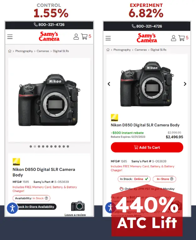
We designed a mockup of what we hypothesized would produce better results for their mobile traffic. Their development team then implemented those changes to their custom ecommerce platform and we set up a product detail page split test on 20 products to validate this hypothesis:
Hypothesis:
By moving the ‘Add to Cart'(ATC) above the fold on mobile devices, and by reprioritizing select elements on the PDP, we will see an improvement to ATC clicks from the detail page with the new layout.